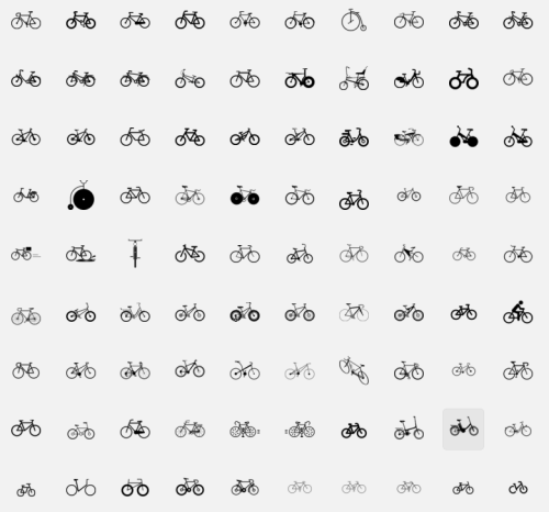
On The noun Project – just a few of the results for “bicycle”
When our favorite source for pre-fab vector images, “The Noun Project” started up a few years ago in the West Loop, we jumped right on board. The concept {at least how it was communicated} was to build an open-source library of essential, universal symbols – simplifying and codifying a global visual language for designers. It succeeded wildly, but the original mission of simplifying things has been buried in a glut of hyper-specific icons. It’s hard to label the result of this drift as a failure, but what is it?
Design culture still struggles to communicate simple concepts to large audiences. Does it matter? If you don’t get it, does that simply mean you’re not the target audience? Every image carries connotations and histories. When you receive visual symbols as they’re intended to be seen, it may be the result of careful strategy and good targeting, or simply by chance. There’s a multi-verse of thinkers both creating and receiving media. When images are responsible for driving action, a few time-honored principles still seem relevant: Know your audience and media environment. Create something compelling. Be as specific as possible without losing your target.
Keep the conversation going. Let us know your thoughts.
