Imagine you show up late to meet a prospective client in wrinkled, scruffy slacks and a crumpled, half-tucked shirt. You’re ready to describe in elegant detail how you and your company can provide the most outstanding service, completely blowing the competition out of the water … but your client has already packed her bag and headed out the door.
Let’s be honest, after that first impression, would you hire you?
5 Second Rule
They say it takes five seconds for someone to form an opinion when meeting someone for the first time. But what about your website—How does the first five seconds on your site look to a potential client? Sometimes you might not even have that long: It has been shown that users will click away from a website if it takes longer to load than a mere two seconds. Do you know how fast your website loads?
Snap Judgment
Most people wouldn’t be caught dead looking like the scenario above in front of prospective client, knowing that the first five seconds are the most important. Now that potential customers are on your site, what do they see: a content-rich website or a site plagued with broken links?
Many potential consumers make quick decisions about the quality of your business based on the look and ease of use of your company site. Young consumers especially take for granted a well-designed website; these digital natives are used to having websites that are visual, easy to navigate, and responsive. If a website isn’t the way they expect it to be, it instantly decreases the credibility of the company—just like a crumpled order ambien from india shirt.
The Renovation
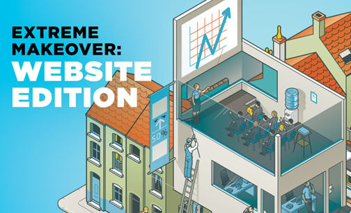
Some sites really do need an extreme makeover, while others just need some maintenance or spring cleaning. A huge makeover isn’t necessary every year—your website should have an enduring style that isn’t a slave to fading fads—but it might be something to discuss every couple of years or so. If your company makes big changes like a new logo and brand colors or completely revamps the tone of the company, a website makeover will be needed to reflect those changes. Taking the time to update your website to accurately reflect who your company is, what you do, and how you can help your clients is well worth it.
The Big Reveal
If planned correctly, a new website design should be a catalyst for great change and advancement in your marketplace. It should take advantage of new technologies and give customers an enhanced online experience. It should tout you as an expert in your field, someone to rely on.
In most industries a strong website should offer a clear explanation of your organization to someone unfamiliar, it should allow them to engage, request more information, or initiate business, and should give some value to existing customers to return. But determining when it’s time to invest in a new website can be tricky business. Our online tool can take you through these questions.
By now you’ve figured out that the one wearing the crumpled shirt isn’t you, but your website. If you need help getting your website into a new fitted suit, call us for a free consultation. We’d be happy to help you try it on.
{{cta(‘1b58025a-e81f-4ce5-9d94-308b09d18d20’)}}
