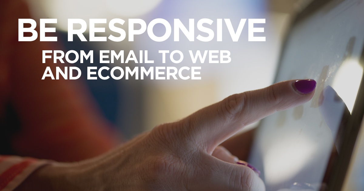
Email marketing campaigns don’t stop when someone opens your email. If your email is successful, it should lead someone to click on a call-to-action, visit your website, and, eventually, purchase your product or service. When 65% of emails are read on mobile devices (and that number is only continuing to grow), it is important that each step along this buyers journey can be done on multiple devices without sacrificing quality and user experience.
Responsive Email
Make sure your email looks beautiful no matter what device or email client the user is viewing. Most email marketing software, like MailChimp or HubSpot, automatically adjust the emails sent through their system. Even when that’s the case, don’t forget to design and layout your email with the user in mind. Make sure that links and call-to-action buttons aren’t too close together that a thumb could slip and click the wrong one, that the images are big enough to be seen but not so huge as to take up the entire screen, and that the text is big enough to be read at a comfortable distance without having to pinch in.
Responsive Web
Now that the email is optimized and they’ve clicked on the CTA, is your website ready to be read on their device? If your website doesn’t respond to the device the viewer is using, buy antibiotics cystitis your potential customer will be frustrated by an unintuituve interface and dealing with tiny buttons, causing them to leave your website, never to purchase from your company. Responsive design, on the other hand, detects what device the website is being pulled up on and adjusts the content accordingly. It’s especially important to make sure that your website is mobile-friendly after April 21, 2015, when Google updates its algorithm.
Responsive Ecommerce
More and more mobile users are purchasing directly from their device—be ready. Are your forms easy to complete? Does your site have the option to pay with Apple Pay, Google Wallet, or PayPal directly? Mobile ecommerce is increasing at a fast pace and social ecommerce is becoming increasingly popular, so it’s also important to adjust for the best experience for your customers.
Don’t lose 65% of your marketing effort. Make the experience a customer has when interacting with you as seamless as possible, whether they’re on a desktop, tablet, or smartphone. If they have to put down their mobile device and continue at a later time on a desktop, it is likely that they could forget or find another company. Don’t take that chance. When you invest in your digital experience, you invest in customer relationships that pay off.
{{cta(‘7de55865-63ea-4ef6-aee0-0bb555d85e59’)}}
